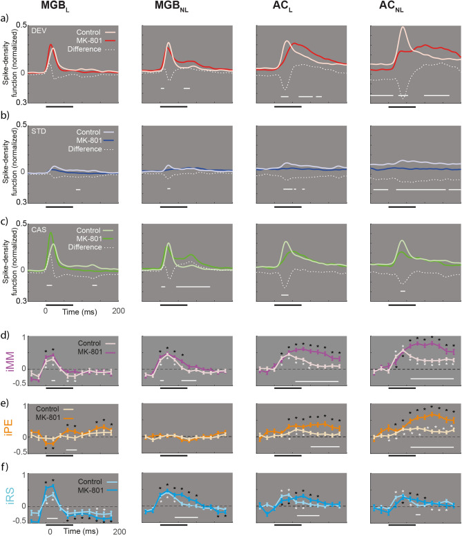
Figure 4.
Spike Density Function. (a-c) Averaged firing rate profiles for each condition as normalized spike-density function (light colors for control and bright color for MK801 group), and their respective differences (white dotted lines). Solid horizontal white lines represent the time in which the difference between groups is significant (two-sample t test p < 0.05, Bonferroni corrected). (d-f) Indices over time computed for 12 intervals (from -50 to 190ms) compared against zero (signed-rank test and FDR corrected for 12 comparisons; *p < 0.01) for each group (light colors for control and bright color for MK801 group). Solid white lines denote differences between groups across time intervals (two-sample t test for each of the 12-time windows, p < 0.05).

