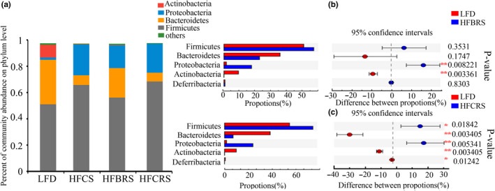
Figure 4.

Bacterial community abundance at the phylum level of each group. (a) Bar chart of taxonomic distribution at the phylum level. Different color bars represent different bacterial phyla. (b) and (c) The Wilcoxon rank‐sum test bar plot of mice between groups at the phylum level (.01 < p ≤ .05 marked as *, .001 < p ≤ .01 marked as **)
