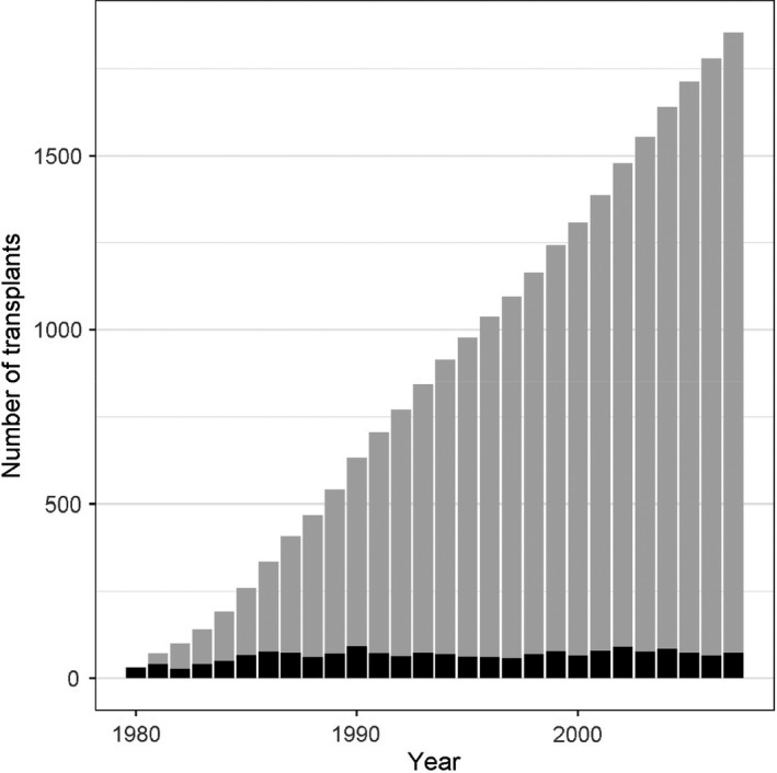
Figure 1.

This bar chart shows the cumulative number of kidney transplants from live donor kidneys (= number of live donor kidney donations) per year from 1980 to 2007 that were included in this risk prediction modelling study. The black bars represent the number of new kidney donations/transplants each year, and the grey bars represent the cumulative sum of kidney donations/transplant until the respective year.
