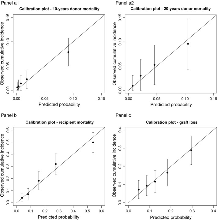
Figure 2.

Calibration plots of all models (Panel a1 donor mortality model at 10, Panel a2 donor mortality at 20 years, Panel b recipient mortality model, Panel c graft loss model). The risk comparison between observed and predicted risk is grouped by quartiles of the predicted risk estimated by the models at ten and twenty years. 95% confidence intervals are added for the observed risks. Perfect agreement between observation and prediction is expressed by all dots lying on the diagonal. 95% confidence intervals intersecting the diagonal depict reasonable calibration of the model. Panel a1: calibration plot for donor mortality model at 10 years. Panel a2: calibration plot for donor mortality model at 20 years. Panel b: calibration plot for recipient mortality model. Panel c: calibration plot for graft loss model.
