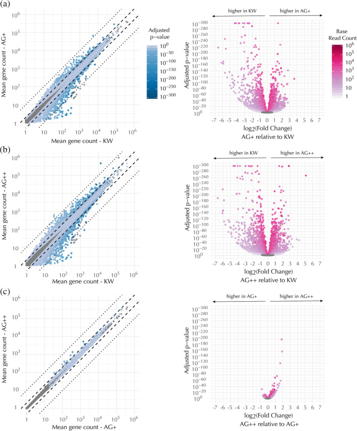
Figure 5.

Transcriptional profiles of the edited lines are similar to each other but distinct from the KW line. Pairwise comparisons of differential expression for each mapped gene, as follows: (a) AG+ versus KW, (b) AG++ versus KW, and (c) AG++ versus AG+. Differential expression levels listed by gene name can be found in Tables S11, S13, and S15, respectively. (Left) Scatter plots of mean gene count in the compared cell types, colored by the adjusted p‐value for detecting a difference between the means. (Right) Volcano plots of the same data showing the adjusted p‐value for detecting a difference between the means as a function of the fold change in expression in the first sample (y‐axis in the corresponding scatter plot) as compared to the second sample (x‐axis in the corresponding scatter plot). In both the scatter and volcano plots, each dot represents a single gene. Means were calculated over RNA‐seq runs from seven biological replicates. Genes that were not significantly differentially expressed (adjusted p‐value >.05) are shown as gray dots
