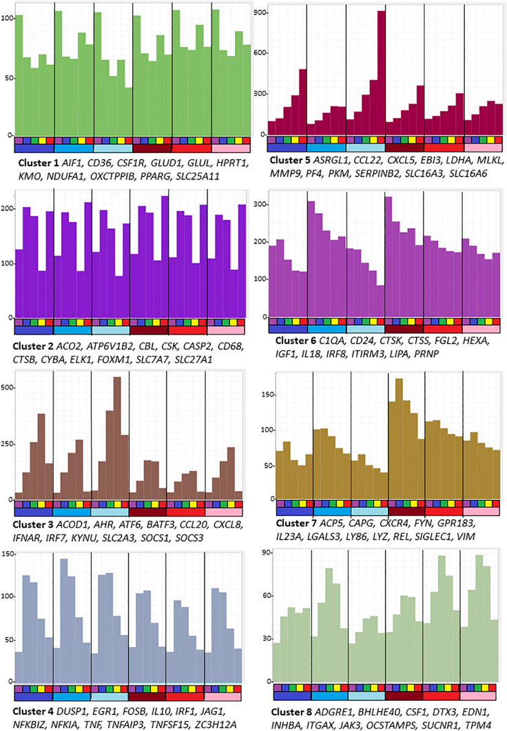
FIGURE 1.
Average gene expression profiles and genes of interest within the clusters of the largest eight clusters (>80 nodes) from the analysis of sheep BMDM treated with LPS. The primary data are in Supplementary Table S5, and full list of clusters and co-expressed transcripts is provided in Supplementary Table S6. Graphia network analysis performed at a Pearson correlation threshold r ≥ 0.75 and MCL inflation 1.7. The Y-axis shows average expression (TPM) of genes in each cluster which indicates the shared pattern driving the correlated expression. For example, Cluster 5 contains transcripts that were each progressively up-regulated by LPS in all 6 animals. Genes named under each panel are representative of each cluster. The bars below the X-axis identify the samples. Each segment is the time course of an individual animal. The upper bar indicates the time point after adding LPS: purple = 0 h; blue – 2 h; green – 4 h; yellow – 7 h; red – 24 h. The lower bar indicates the sex of each individual: blue – males; red – females.

