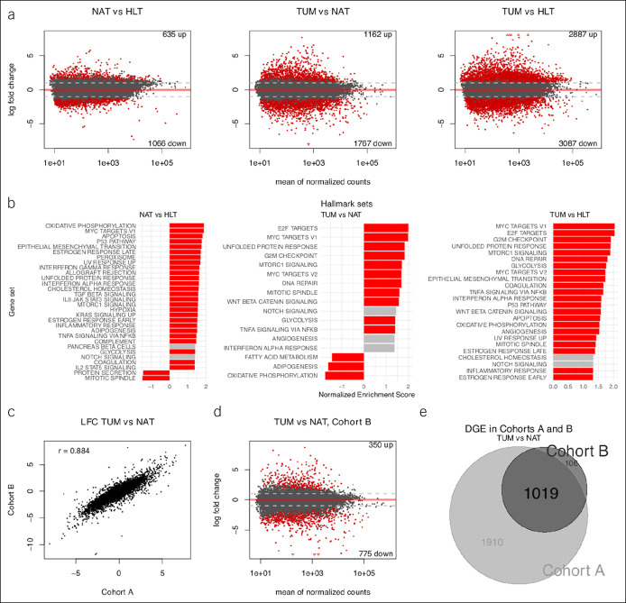
Figure 3.
Transcriptome-wide comparison across phenotypes. (a) Scatterplots (i.e., MA plots) depicting LFC vs gene expression across phenotypes in cohort A; red demonstrates DGE at FDR 5%. Number of differentially expressed genes shown in top right and bottom right. (b) Bar plots of GSEA results for overrepresentation of hallmark gene sets in DGE results across phenotypes in cohort A; red demonstrates enrichment at FDR 5%. Only hallmark sets with absolute NES >1.3 are shown. Genes were preranked by test statistics from their respective comparisons. (c) Scatterplot of LFC for all shared genes across cohorts A and B in the TUM vs NAT sample comparisons; Pearson correlation shown in top left. (d) MA plot depicting LFC vs gene expression for the TUM vs NAT sample comparison in cohort B; red demonstrates DGE at FDR 5%. (e) Venn diagram demonstrating intersection of DGE lists from the TUM vs NAT sample comparisons in cohorts A and B. DGE, differential gene expression; FDR, false discovery rate; GSEA, gene set enrichment analysis; LFC, log2 fold change; NAT, normal-adjacent-to-tumor; NES, normalized enrichment score; TUM, tumor.

