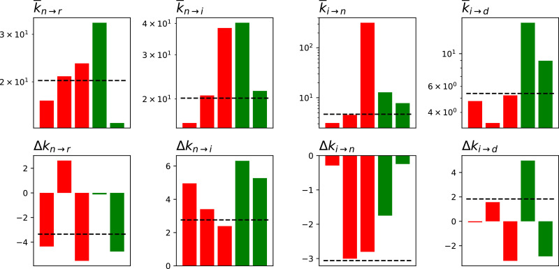
Fig. 3.
Values of the fitted parameters, in terms of their average ( top row) and variation (Δk, bottom row). The three red bars correspond to the three regions with higher mortality, i.e. Liguria, Lombardy and Piedmont; the two green ones, to the regions with lower mortality, i.e. Lazio and Veneto. The horizontal dashed lines correspond to the values for Italy as a whole. (For interpretation of the references to colour in this figure legend, the reader is referred to the web version of this article.)

