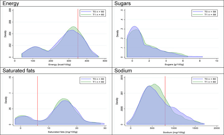
Fig 29. Density curves for the amount of energy and nutrients of concern in cheeses, longitudinal subsample.
The blue line represents the distribution in T0 (preimplementation), the green line represents the distribution in T1 (postimplementation), and the red line represents the cutoff for the amount of energy or nutrients of concern.

