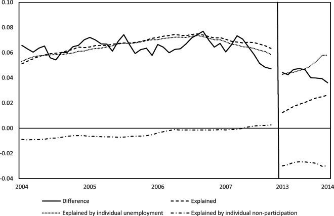
Fig. 2.
Decomposition results with shifting comparison period. Note: The figure shows the results of the decomposition of the change in the entry rate into self-employment (in percentage points) when comparing a shifting time window to the Great Recession period (9/2008-8/2009). The comparison period is always a year wide. For each month in the graph, the results for the comparison period starting in that month are displayed. The solid line shows the difference between the entry rates into self-employment in the Great Recession and the comparison period, the dashed line the explained part of this difference, and the dotted line the part of the difference explained by individual unemployment. For example, for 04/2007 and 05/2013, the figure shows the same results as Table 5. No results are shown for 10/2007-04/2013 (solid vertical line) when the comparison period would be close to the recession. Source: Own illustration based on the Current Population Survey 2004-2014

