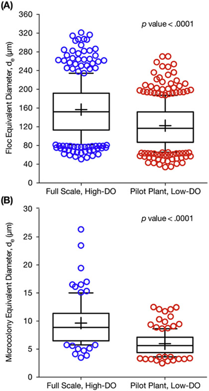
Figure 5.
Box plots comparing (A) floc size distribution (by median), and (B) AOB microcolony size distribution (by median) for the full-scale plant operating with high DO concentrations and the pilot plant during low-DO operation. The upper and lower bounds of the boxes represent the 25th and 75th percentiles, the whiskers denote the 10th and 90th percentiles, the circular symbols are the outliers, and the plus symbol represents the mean.

