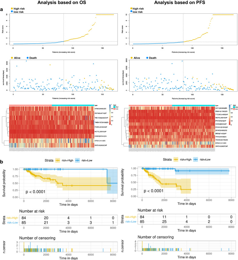
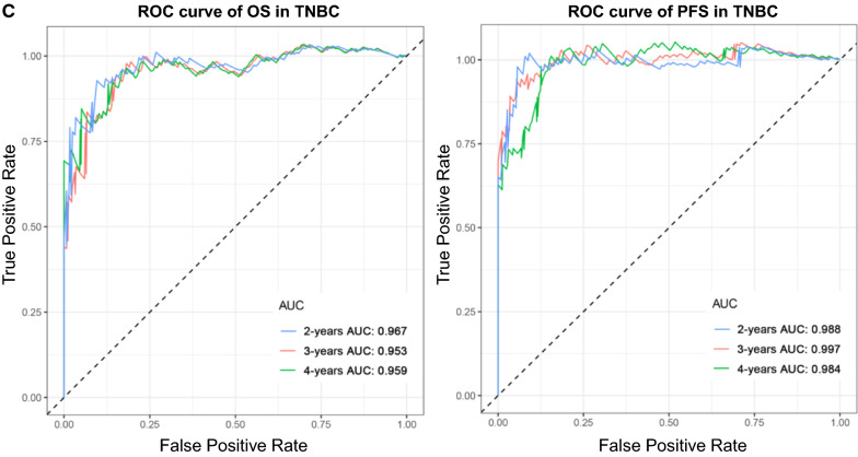
Fig. 7.
Analysis of the AS multivariate prognostic model in TNBC from two aspects of OS and PFS. a Upper part shows the risk score curves for survival-AS events; the middle shows survival status and survival times of TNBC patients ranked by risk score. The black dotted line represents the optimum cut-off point dividing patients into low- and high-risk groups; the bottom shows the heat map of the PSI value of survival-AS events. Colours from red to blue indicate decreasing PSIs from high to low. b Upper part shows the Kaplan–Meier curves for the high- and low-risk groups; the middle shows the number of living patients variation with time in the high- and low-risk groups; the bottom shows the number of censoring variation with time in the high- and low-risk groups. Blue colour represents low-risk group data, whereas yellow colour represents high-risk group data. c The ROC curves of prognostic models at 2, 3 and 4 years. Blue colour represents 2 years, red colour represents 3 years, and green colour represents 4 years. The columns on the left represent OS, whereas the columns on the right represent PFS. PSI percent spliced in, ROC receiver operator characteristic, AUC area under the curve


