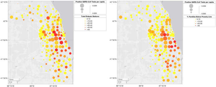
Figure 2.
(Left panel) Distribution of severe acute respiratory syndrome coronavirus 2 (SARS-CoV-2)–positive tests overlapped with number of dialysis stations within a zip code. The larger the circle, the higher the number of SARS-CoV-2–positive tests per capita. Red indicates highest number of dialysis stations. (Right panel) Distribution of SARS-CoV-2–positive tests overlapped with poverty status as measured by the percentage of households within a zip code living below the federal poverty line. The larger the circle, the higher the number of SARS-CoV-2–positive tests per capita. The color scheme indicates percentage of households within a zip code living below the federal poverty line, with red indicating >40% and yellow indicating <10%.

