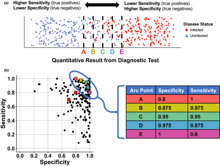
FIGURE 1.

Infection status for a group of individuals relative to the sensitivity and specificity of test thresholds (top), and the values we chose for simulations relative to levels reported in the literature. (a) The true infection status (red circles = infected, blue triangles = uninfected) is plotted for hypothetical test results in a group of individuals. The x‐axis represents a range of quantitative test results, with lower test results on the left and higher test results on the right. A threshold must be chosen, above which value a test result is considered positive. Thresholds that correspond to points A‐E in b are shown as dashed black lines, demonstrating the trade‐off between sensitivity (True Positives/(True Positives + False Negatives)) and specificity (True Negatives/(True Negatives + False Positives)). (b) Diagnostic test sensitivities and specificities previously reported in the literature (Alberg et al. 2004; Maxim et al. 2014), shown as black circles. For data simulations, the sensitivity/specificity values of test 1 and test 2 were set at 70%/70% and 80%/80%, respectively (shown as red squares). The fixed specificity provided to the Bayesian model was selected from points A‐E (table on right)
