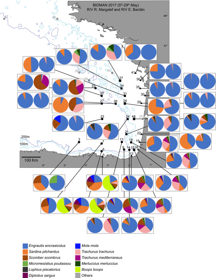
FIGURE 5.

Pie charts showing the relative abundance of eDNA reads (first chart) and fish biomass caught (second chart) obtained from the 30 groups of stations within a 20 nm ratio. eDNA charts include species with >10 reads only. Species with >5% biomass caught/number of reads per station are coded by colors, the rest are grouped in “others”
