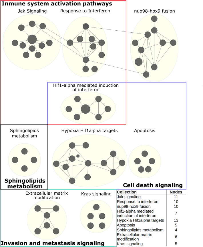
Figure 4.
Positive enriched map for Cluster A. Each black circle (node) represents a pathway, circle size represents the number of genes represented between the gene sets and data. Links between pathways were established when 2 pathways had a Jaccard index > 0.4, given the expressed genes. Colour squares denote a category that comprises several collections (yellow circles) with shared biological function. The embedded table shows the number of pathways enriched in each collection. All the enriched pathways had an FDR < 0.05 and a p value < 0.01.

