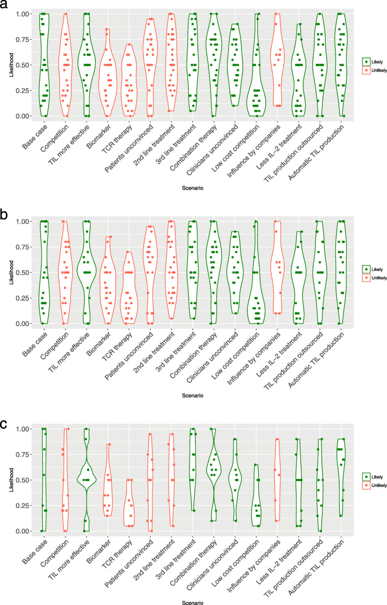
Fig. 2.
Likelihood of scenarios. Caption: This violin plot shows all observations from the survey in points. In addition, it shows the distribution of the likelihood per scenario by making the graph wider or smaller. When a number of observations are seen at the same likelihood percentage, the plot becomes wider. a shows the estimated likelihood of the future scenarios by all respondents (n = 29), b shows the estimated likelihood by only the respondents that evaluated themselves as an expert or familiar (n = 23), c shows the estimated likelihood by only the respondents with ≥1 year of experience with TIL therapy (n = 10). The colors green (“likely”) and red (“unlikely”) correspond to the final label of the scenarios that followed from the steps shown in Fig. 2 and according to the reasons stated in Supplement 5

