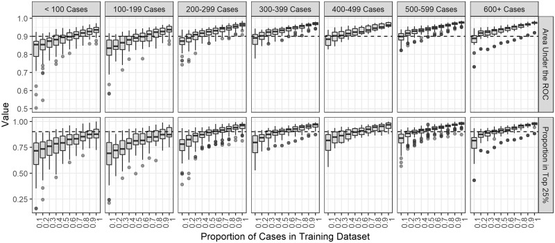
Figure 4.
Boxplots of the performance metrics by training set proportion in 300 simulated outbreaks stratified by the total sample size of the outbreak. The metrics shown are the area under the receiver operating curve (ROC) and the proportion of time the relative transmission probability of the true source case was ranked in the top 25%. The dotted black line indicates a value of 90% on either metric.

