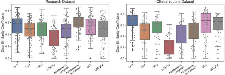
Fig. 1.
DSC performance of the different automatic segmentation methods. Left : ADNI research dataset Right : clinical routine dataset. The boxplots show the median and the 25% and 75% percentiles of the metrics distribution. Values outside the whiskers indicate outliers. Gray dots show the value for individual participants. .

