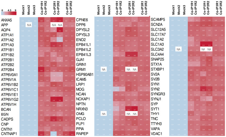
Figure 4.
Heat map representation of the 72 differentially abundance proteins. The heat map shows the abundance of each protein in each co-IP (and replicates) compare to the control condition (Mock). In the color scale, sky blue represents proteins with low levels, and red represents proteins with high levels of abundance. White spots represent proteins with no signal available (NA).

