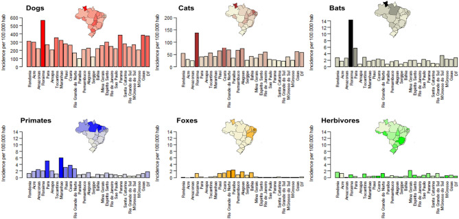
Figure 1.
Bite incidence by different species across Brazil in 2016. Each specie's incidence is shown by a different color. The darker the color on each bar, the higher the incidence. Colors of insert maps represent incidence for each state using the same colors as in the bar charts. For comparison, the y-axis in the barplots for wildlife ranges from 0 to 14.

