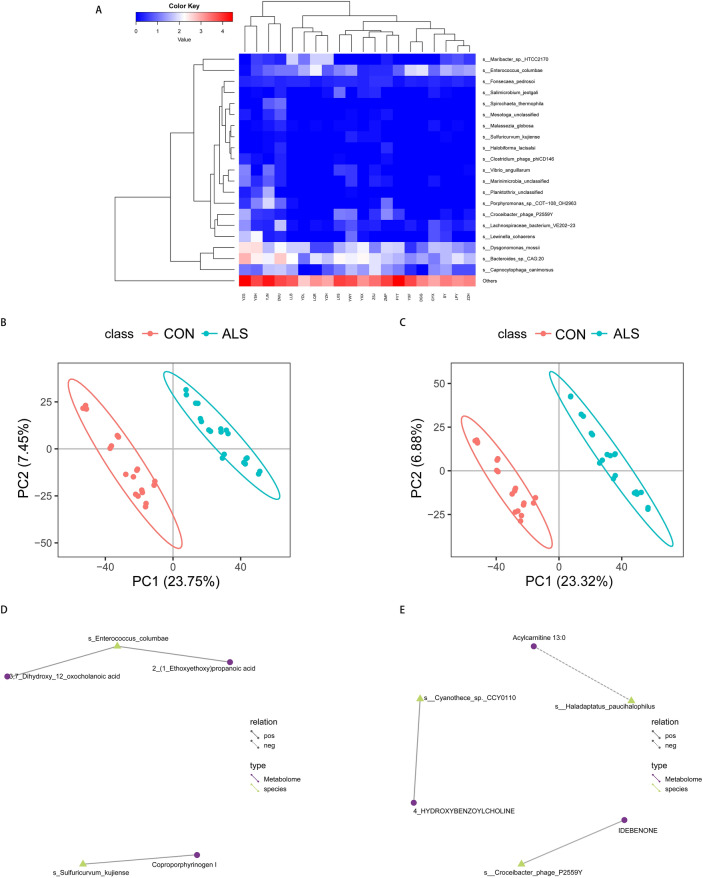
Figure 4.
The associations of gut microbial metabolites and species. (A) Taxa heatmap via metagenomics reveals the microbial composition at the species level and only the top 20 in relative abundance based on Bray–Curtis distance are presented in the diagram. (B,C) PLS-DA score charts in the negative and positive ion mode are suggestive of the difference in metabolites between the groups (q ≤ 0.05, VIP ≥ 1.0 and |log2FC|> 1). The discreteness of symbols in different colors represent the distribution trend of the two groups on the PC1 and PC2 axes, respectively. (D,E) Network of differentially expressed species and metabolites in the negative and positive ion mode. The yellow triangles represent the species and the purple circles the metabolites. The solid line indicates a positive correlation, and the dashed line shows a negative correlation between the species and metabolites.

