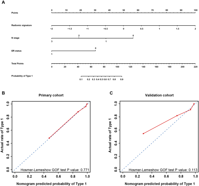
Fig. 5.
Nomogram, calibration curve of the nomogram in both cohorts. The red line represents the performance of the nomogram. The blue dotted line represents an ideal prediction.
a Nomogram for the combined prediction model.
b Calibration curve of the nomogram in the primary cohort.
c Calibration curve of the nomogram in the validation cohort.

