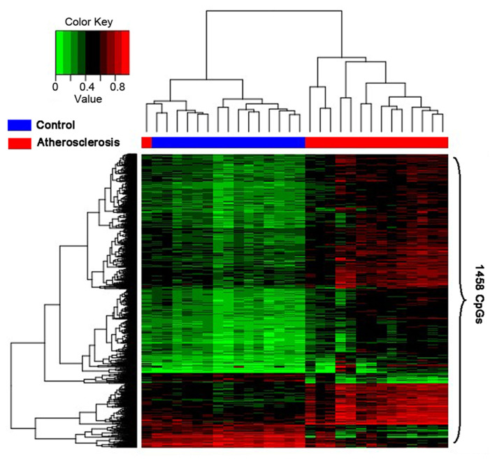
Figure 2.
Hierarchical clustering was performed as a heatmap, which shows distribution of the differential CpG methylation level and the high and low methylation in samples. The column and row, respectively, represent the samples and the CpG sites. The color shows a quantitative measure of methylation for each CpG site with range between 0 (no methylation) to 1 (complete methylation). Green represents the low methylation and red represents the high methylation. Healthy controls and atherosclerosis samples are shown by the blue and red bars, respectively.

