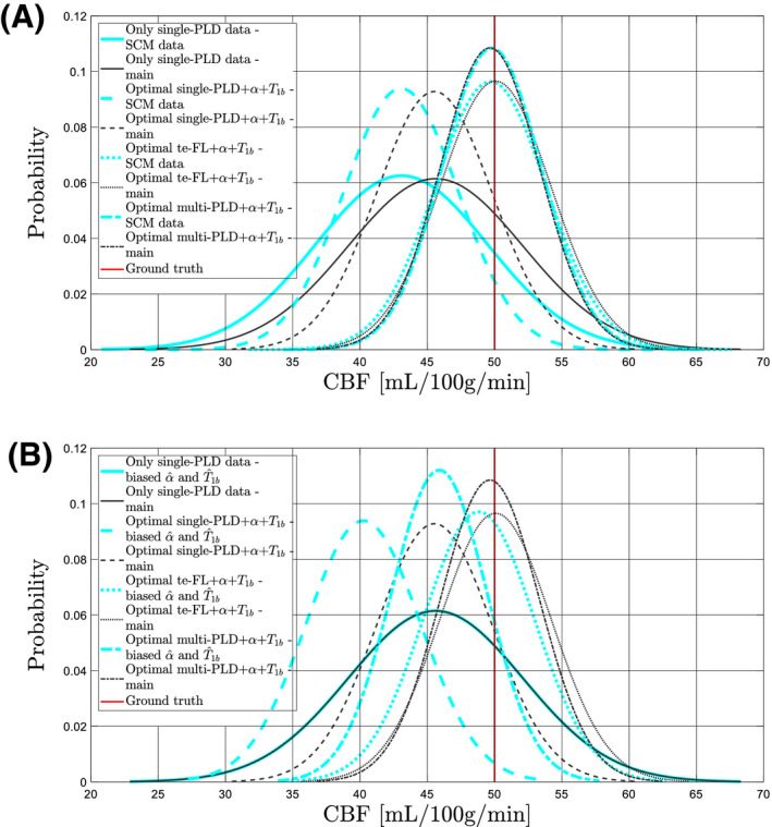
Figure 5.

Results for 4 protocols are shown: the protocol with only single‐PLD PCASL data and the optimal protocol for each considered ASL modality. The black curves in subfigures (A) and (B) represent the normalized distributions of CBF estimates obtained from the main implementation of the simulation experiment with the realistic data simulation model. The cyan curves in subfigure (A) represent CBF estimate distributions for the exact same protocols, yet for data simulation using the single‐compartment model (SCM) as defined in Equation (5). In subfigure (B), the cyan curves represent CBF estimate distributions for the same protocols with an offset bias of 5% overestimation of both α and . Note there is no difference for the protocol with only single‐PLD PCASL data in (B), as no measurement of α and is performed in that protocol
