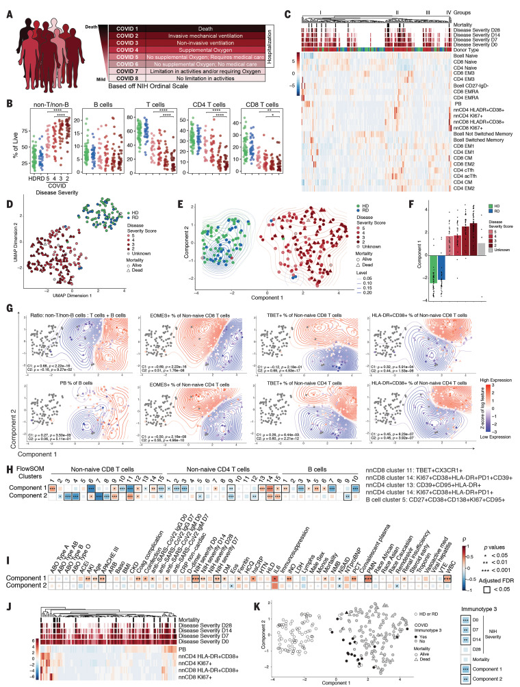
Fig. 6. High-dimensional analysis of immune phenotypes with clinical data reveals distinct COVID-19 patient immunotypes.
(A) NIH ordinal scale for COVID-19 clinical severity. (B) Frequencies of major immune subsets. Significance was determined by unpaired Wilcoxon test with BH correction: *P < 0.05, **P < 0.01, ***P < 0.001, and ****P < 0.0001. (C) Heatmap of indicated immune parameters by row; donor type, disease severity, and mortality are indicated across the top. (D) UMAP projection of aggregated flow cytometry data. (E) Transformed UMAP projection. Density contours were drawn separately for HDs, RDs, and COVID-19 patients (see Materials and methods). (F) Bars represent mean of UMAP component 1. Dots represent individual participants; bars are color-coded by participant group and/or severity score. (G) Density contour plots indicating variation of specified immune features across UMAP component coordinates. Relative expression (according to heat scale) is shown for both individual patients (points) and overall density (contours). Spearman’s rank correlation coefficient (ρ) and P value for each feature versus component 1 (C1) and component 2 (C2) are shown. (H) (Left) Spearman correlation between UMAP components 1 and 2 and FlowSOM clusters. (Right) Select FlowSOM clusters and their protein expression. (I) Spearman correlation between UMAP components 1 and 2 and clinical metadata. (J) Heatmap of immune parameters used to define immunotype 3 indicated by row; disease severity and mortality are indicated across the top. (K) (Left) Transformed UMAP projection; patient status for immunotype 3 indicated by color. (Right) Spearman correlation between immunotype 3 and disease severity, mortality, and UMAP components.

