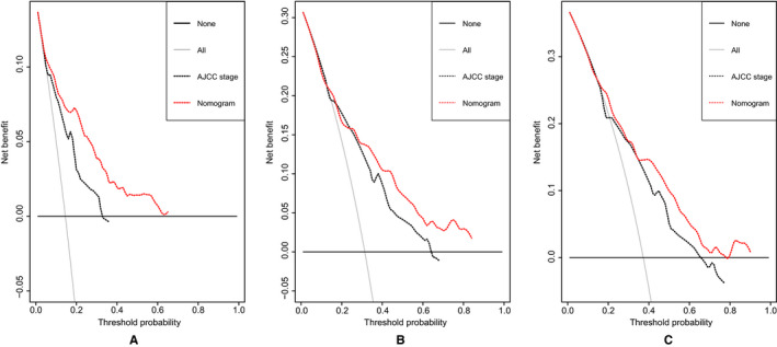
FIGURE 5.

DCA plots of the nomogram and the AJCC staging system for 1‐year (A), 3‐year (B), and 5‐year (C) survival prediction. The horizontal coordinates represented the threshold probability, and the vertical coordinates represented the net benefit rate. The red dash line stood for the DCA of the nomogram, and the black dash line stood for the DCA of the AJCC staging system. The black solid line assumed all patients were alive, and the gray solid line with a negative slope assumed all patients were dead. DCA plot could reflect the model with the greatest net benefits had the highest clinical use
