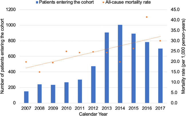
Figure 2.
Secular trends of entry into the study cohort and all-cause mortality rates. The X-axis depicts calendar year over the study period. The Y-axis on the left depicts the number of patients entering the cohort and is represented by the blue bars. The Y-axis on the right depicts the mortality rate (per 1000 person-years) and is represented by the orange dots. The total Partners Healthcare patient population increased at a relatively stable rate over this time period.

