Fig. 4.
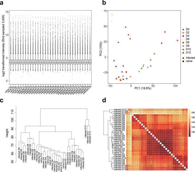
Quality check of BeadChip gene expression data of PcCB blood samples. (a) Box plot showing distribution of 3,000 randomly sampled probe signals for normalised PcCB blood expression data. The median, two hinges, two whiskers and outlying points were shown. (b) Principal component analysis of normalised expression data of naïve and infected blood samples. (c) Hierarchical clustering plot of normalised intensity data among the samples was generated using agglomerative clustering with average linkage. (d) Heatmap of Euclidean distance. A full feature set was used for (b-d). This dataset was submitted to GEO (GSE93631).

