
FIGURE 6.
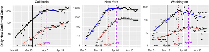
Standard plots for California, New York, and Washington State, augmented with data on confirmed deaths. The vertical black line indicates the intervention date for each state. The sloped lines indicate the fitted values from the learned‐delay method applied to the confirmed case data (blue) and the confirmed deaths data (red)