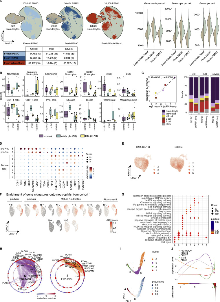
Figure S6.
Overview of scRNA-Seq Dataset from Cohort 2 and Additional Characterization of Neutrophils, Related to Figure 7
(A), UMAP (on the left) of the complete scRNA-seq dataset from cohort 2 (frozen PBMC, fresh PBMC, fresh whole blood), encompassing 98 samples from 16 controls, 8 mild, and 10 severe COVID-19 patients. Right panel: violin plots of the number of genic reads, transcripts and genes expressed in the PBMC (right) versus the granulocyte fraction (left) across the different datasets of cohort 2. The UMAP is split by experimental condition and the classified granulocyte and PBMC fractions are marked separately. The table below indicates the number of cells per experimental condition separated by control, COVID-19 mild and COVID-19 severe. The numbers of samples are indicated in brackets.
(B), Box and whisker plots (25–75 percentile) of cell type frequencies identified by scRNA-seq in fresh whole blood samples after erythrocyte lysis comparing 16 samples from 15 controls, 6 from 5 mild COVID-19 and 12 from 4 severe COVID-19 patients.
(C), Comparison between cell frequencies identified by scRNA-seq and MCFC. Pearson’s correlation between the mean of each cell population measured in MCFC (y axis) and by scRNA-seq of R2 = 0.96 with p = 0.0098 (left). The stacked bar chart sorted by disease severity shows the cell type frequency for controls (n = 16), mild (n = 5) and severe COVID-19 samples (n = 18) split by scRNA-seq and MCFC.
(D), Dot plot of literature-based marker genes classifying different neutrophil subsets.
(E), UMAP of neutrophils showing the scaled expression of MME(CD10) and CXCR4 with enrichment in the control-specific clusters 0.
(F), UMAP of AUCell-based enrichment of gene signatures derived from the neutrophil clusters from cohort 2 on the UMAP visualization of cohort 1. The UMAP is colored by the ‘Area Under the Curve’ (AUC) scores of each cell.
(G), Dot plot visualization of selected significantly enriched Gene Ontology terms and KEGG pathways for each cluster from the neutrophil space. The dots are colored by their adjusted p value and the size of the dots is defined by the number of genes found in the Gene Ontology term.
(H), Network representation of marker genes and their predicted upstream transcriptional regulators for neutrophil clusters 6 (pre-Neutrophils) and 8 (pro-Neutrophils). Edges represent predicted transcriptional regulation. Transcription factors in the inner circle and their predicted target genes in the outer circle are represented as nodes sized and colored according to the scaled expression level across all clusters. Selected genes and transcription factors were labeled based on connectivity and literature mining.
(I), Diffusion map dimensionality reduction of the main neutrophil clusters 8, 6, 2, and 1 from the severe COVID-19 patients (top) and diffusion pseudotime visualized on the diffusion map indicating the transition probability of the different clusters in the following order: 8 - 6 - 2 - 1 (bottom).
(J), Genes specific for each cluster (HSP90AA1, CD274(PD-L1), CD177, MME(CD10), ARG1) visualized along the diffusion pseudotime (top) with the density of each cluster along the pseudotime (bottom) highlighting the proposed order of differentiation of the different neutrophil subsets.

