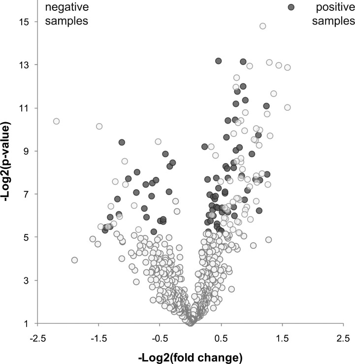
Fig. 2.
Volcano plot indicating proteins present in both sample sets but with statistical difference in relative abundance according to spectrum counts. Each spot represents one protein. In the y-axis Log2(p-value) is indicated. In the x-axis Log2(fold-change) is shown (negative values indicate proteins overrepresented in negative samples and positive values show proteins overrepresented in positive samples). Blue dots correspond to proteins that show a statistical difference in relative abundance between conditions.

