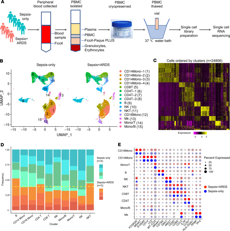
Figure 1. scRNA-seq analysis reveals the cellular composition of PBMCs in sepsis-only and sepsis+ARDS patients.
(A) The schematic illustrates the experimental design and work flow. (B) PBMCs were analyzed from sepsis only (n = 4) and sepsis+ARDS (n = 3) patients and projected with uniform manifold approximation and projection (UMAP) plots with colors and the number in parenthesis indicating the identified cell cluster. (C) The heatmap depicts the marker genes corresponding to each cluster identified in B. (D) The frequency of each cell type is depicted in the columns. Each patient is represented by an individual color in a shade of blue/green (sepsis-only) or orange/red (sepsis+ARDS). The yellow dashed line represents an equal frequency between the 2 groups, since there are 4 sepsis-only patients and 3 sepsis+ARDS patients. (E) The plot shows identification of marker genes for each cell cluster, with the size of the dot corresponding to the percentage of cells within the cell population expressing the gene. The brightness of the color represents the average expression level across all cells within the cluster. Blue and red dots indicate sepsis-only and sepsis+ARDS patients, respectively. CD14Mono, CD14+ monocyte; CD8T, CD8+ T cell; CD4T, CD4+ T cell; B, B cell; NK, NK cell; NKT, NK T cell; CD16Mono, CD16+ monocytes; Mk, megakaryocyte.

