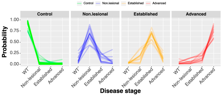
Figure 6.
Classification of samples into disease progression groups. Parallel plot illustrating the classification of individual samples by elastic net regression. Each line represents a sample, and the highest point in the line corresponds to the group where the sample would be classified with higher probability.

