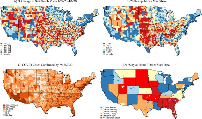
Fig. 2.
Geographic variation in social distancing, partisanship, COVID-19, and public policy.
Note: Figure shows the U.S. geographic distribution of social distancing, political affiliation, COVID-19, and public policy responses. Panel A shows, for each county, the percent change in aggregate visits between the week beginning January 27, 2020 and the week beginning April 6, 2020. Blue shading denotes a more negative percent change in visits during the latter week relative to the former. Red shading indicates an increase or a smaller decrease in visits. These visits are sourced from SafeGraph's mobile device location data. Panel B maps counties by the Republican presidential vote shares in the 2016 election. Red shading in this panel indicates more Republican counties, and blue shading indicates more Democratic counties. Panel C shows for each county the number of COVID-19 cases confirmed by July 12, 2020 (sourced from The New York Times). Panel D shades US counties by the effective start date for the earliest “stay-at-home” order issued (see Section 3 for sources). Blue shading indicates an earlier order, while red shading indicates that an order was issued later or was never issued. (For interpretation of the references to colour in this figure legend, the reader is referred to the web version of this article.)

