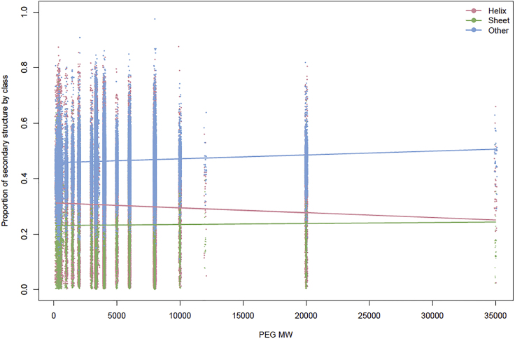
Figure 4.
Scatterplot of Secondary Structure Profiles by PEG MW and Model Fitted Values
Each PDB ID has a secondary structure profile, which contains the relative percentage of helix (pink), sheet (green), and other (blue). Each profile is plotted at the PEG MW in that PDB ID cocktail, which gives a scatterplot of the data (data points jittered). These data illustrate the non-uniform distribution of PEG MW and reveal that the number of PDB IDs associated with each PEG MW is highly variable. Overlaid on the scatterplot are the DMN regression model fitted values computed using model coefficients. These results show the relationship between each secondary structure class and PEG MW. For instance, the helix fitted regression line (pink) shows a clear decrease as PEG MW increases.

