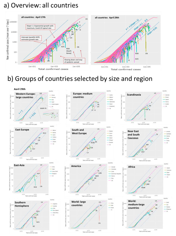
Figure 4.
‘Rise-and-fall’ trajectories of Covid-19 pandemic: (a) Trajectories of all 187 countries considered by Johns Hopkins Data Center plot new confirmed cases as a function of total cases in double logarithmic scale. They visualize the state of the epidemic with country-wise resolution. Exponential growth is reflected by a line parallel to the diagonal y = x (slope = 1) followed by a fall reflecting slowing down of the epidemic. The slope equals the difference between the transmission and removal rate factors, c–k. The slope = 0.01 line consequently refers to the more as tenfold reduction of the maximum transmission rate observed for many countries in their linear rising part. With time (compare left and right plots) the number of countries crossing this line increases. (b) Trajectories for groups of countries characterize the epidemic in countries of different population sizes and regions of the world. Trajectory of the USA (with the highest infection numbers worldwide) is shown for comparison in all plots. Letter codes for countries were chosen according to the international vehicle registration code (https://en.wikipedia.org/wiki/International_vehicle_ registration_code).

