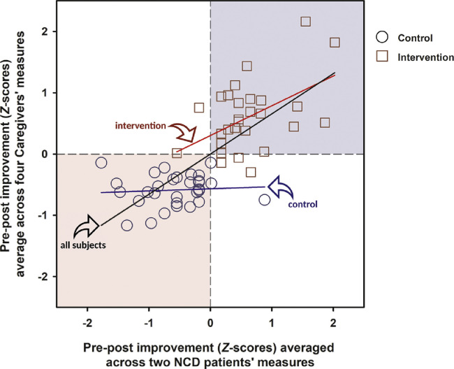
FIGURE 2.
Scatter plot of pre–post changes observed in the care-recipients with NCD and their spousal caregivers based on relevant outcome measures that yielded statistical evidence for a group effect across time. Pre–post changes were normalized with respect to the mean and standard deviation of all subjects (N = 60), and then averaged to provide the summative indices for improvement (i.e., positive changes) in care-recipients and their caregivers, as represented by the abscissa and ordinate axes, respectively. Three regression lines, indicated by the arrows, are fitted to all or a subset of the data. The black regression line through the origin is fitted to all 60 dyads [ANOVA of the linear regression was highly significant at F(1,58) = 65.25, p <0.001; R2 = 0.53, b = 0.66 ± 0.08]. The red regression line is fitted to the dyads in the intervention group (N = 30) [ANOVA of this linear regression was significant at F(1,28) = 9.21, p = 0.005; R2 = 0.25, b = 0.49 ± 0.16], whereas the blue regression line is fitted to dyads in the control group (N = 30), of which no significant association in pre–post changes between partners of the dyads was found [ANOVA of this linear regression was far from statistical significance F(1,28) = 0.15, p = 0.70; R2 = 0.005, b = 0.04 ± 0.09]. The light blue and pink backgrounds show the location of quadrants I and III in the Cartesian plane, where most of the intervention and control groups lay, respectively.

