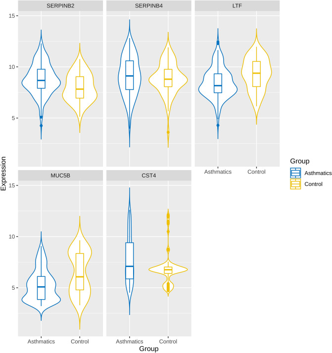
Figure 5.
Violin plots of 5 hub genes filtered based on functional enrichment analysis and PPI network centrality measures respectively. This plot represents the distribution density of the underlying expression data for hub genes. The top and bottom of the embedded box signify the 75th and 25th percentile of the distribution, respectively. The line inside the box represents the median. Endpoints of the axis are labelled by the minimum and maximum values. Control and asthmatic samples are distinguished by yellow and blue colors, respectively.

