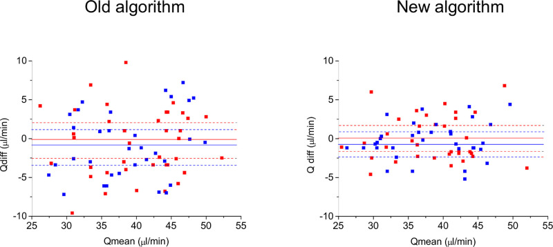
Figure 3.
Bland-Altman plots for reproducibility data. The x-axis shows the mean between the two measurements (Qmean), the y-axis shows the difference between the two measurements (Qdiff). The data for arteries are presented in red and the data for veins are presented in blue. The mean value of the difference (solid line) and the 95% confidence intervals are also shown (dashed line).

