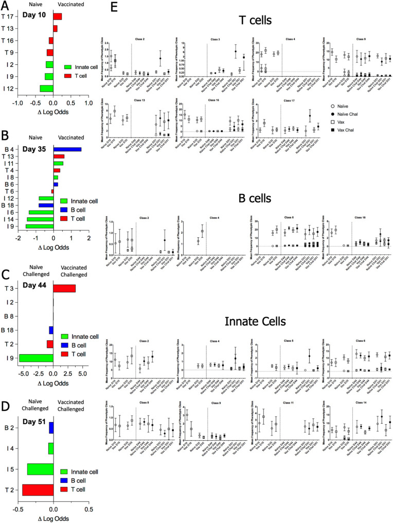
Figure 3.
Distribution of phenotypic classes across vaccination and challenge. For each timepoint, an EN regression analysis was used to determine the probability of assignment to either experimental group, using the median frequency of each phenotypic class per mouse on that day. The graphs identify cell classes with highest predictive value for distinguishing vaccinated vs naïve mice pre-challenge (A,B) or vaccinated challenged v naïve challenged mice (C,D) based on the magnitude of their logit coefficient, which is a measure of the influence of change in the abundance of the cluster between experimental groups on the predictive value of the cluster. Phenotypic class names are as assigned in Fig. 2. In panel E, plots indicate the median frequency and standard deviation of a phenotypic class per experimental group across timepoints for selected classes that have high predictive value. The dotted vertical line indicates intranasal challenge with Cb. For phenotypic classes with multiple clusters at a given timepoint, all clusters are plotted individually. Plots of all classes are shown in Supp Fig. 4A–C are provided in supplementary data.

