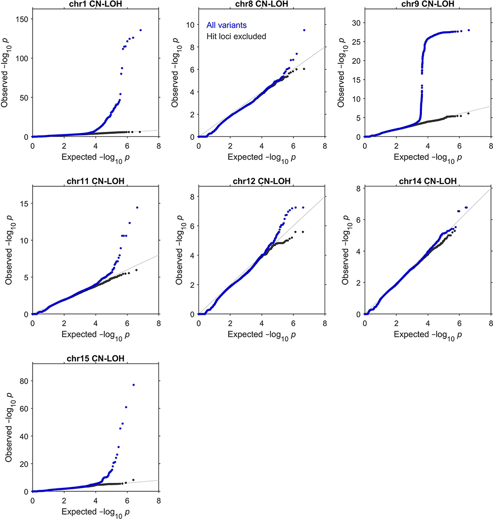
Extended Data Figure 4: Quantile-quantile plots of P-values produced by association analyses.
These plots verify the calibration of the statistical tests we used to identify the genome-wide significant associations reported in Extended Data Table 1 (see legend for details of statistical tests and sample sizes). In each plot, the blue dots correspond to an analysis of all variants tested, while the black dots correspond to an analysis in which regions surrounding significant associations were excluded. Specifically, the plots respectively exclude 1:35–55Mb (MPL), 1:239–244Mb (FH), 8:88–93Mb (NBN), 9:2.5–7.5Mb (JAK2), 11:92–97Mb (MRE11), 11:103–113Mb (ATM), 12:109–114Mb (SH2B3), 14:92.5–102.5Mb (TCL1A and DLK1), and 15:100Mb–qter (TM2D3). In all cases, exclusion of the hit regions (which account for a small fraction of the variants tested) resulted in a distribution close to the expected null.

