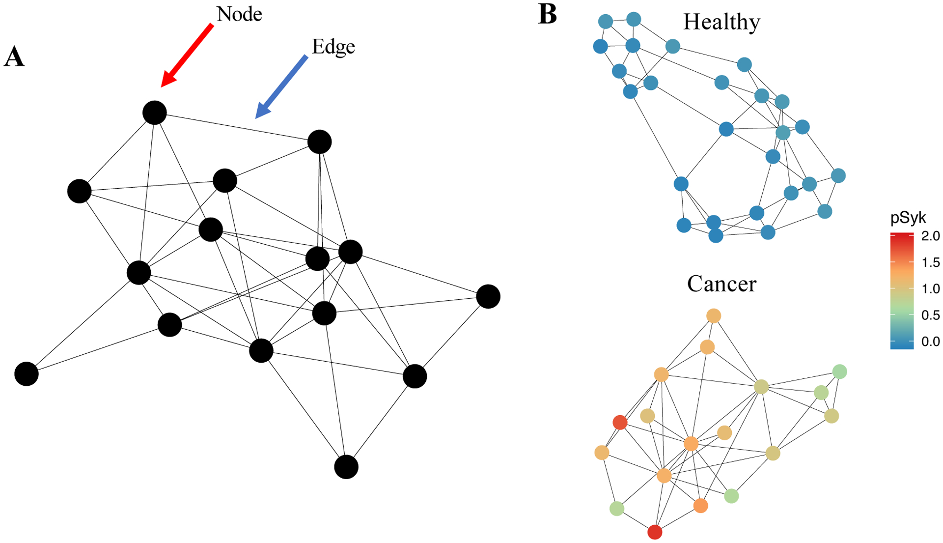
Figure 5 – Graph architectures can be used to represent cytometry data.

(A) Schematization of a “graph,” a data structure that expresses observations as nodes and the relationships between observations as edges. The red arrow points to a node; the blue arrow points to an edge. (B) Example graphs constructed from cytometry data collected via CyTOF (data taken from Good et al., 2018). This is an example of a graph representing single-cell cytometry data: in it, the nodes represent clusters of single-cell observations and the edges represent relationships between those nodes. In this case, a k-nearest-neighbor graph was built, meaning that each cluster is connected to the k clusters to which it is most similar (using Euclidean distance and k = 3). (B) Clustering was performed by applying PhenoGraph in healthy and leukemic samples. Each cluster’s expression level of phosphylated Syk protein (pSyk), a relapse-predictive feature in pediatric BCPALL, is indicated colorimetrically for each node. This example graph illustrates how biological parameters can be depicted by using a graph-based representation.
