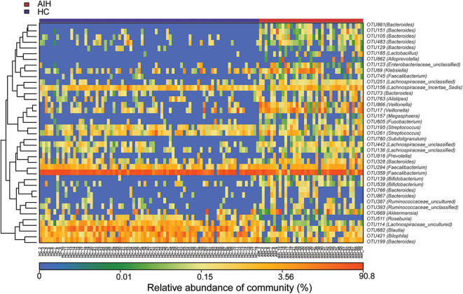
Figure 3.
Heatmaps for relative abundances of differential OTUs between AIH (N = 37) and HCs (N = 78). For each sample, the columns show relative abundance data for differential OTUs on the right. The relative abundance of each OTU was used to plot the heatmap (blue, low abundance; red, high abundance). Group data are shown above the plot: HCs, left, blue line; AIH patients, right, red line. Each row represents one OTU. AIH, autoimmune hepatitis; HCs, healthy controls; OTUs, operational taxonomic units.

