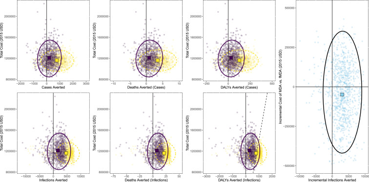
Figure 3.
Scatterplots of cost vs. outcomes derived from probabilistic sensitivity analysis of trial results. Focal mass drug administration (fMDA) is shown in dark purple and MDA shown in light yellow; ellipses are 95% CI and are also shown in dark purple solid lines for fMDA and in light yellow dashed line for MDA (black for incremental analysis of MDA vs. fMDA). Squares represent the center of data clouds with light yellow for MDA and dark purple for fMDA. Rightmost chart is the incremental analysis of MDA compared with fMDA. Dashed black lines in disability-adjusted life year (DALY) chart represent a willingness to pay a threshold of 1,414 USD (approximately equivalent to the gross domestic product of Zambia per capita at the time of the trial). This figure appears in color at www.ajtmh.org.

