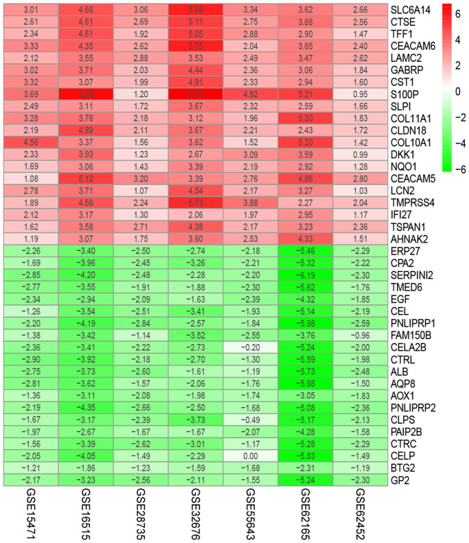
Figure 3.
The heat map of top 20 down- and upregulated differentially expressed genes in the integrated microarray analysis. Each column represents one dataset and each row represents one gene. The number in each rectangle represents the value of log2(FC). The red column represents the upregulated genes and the green column represents the downregulated genes.

