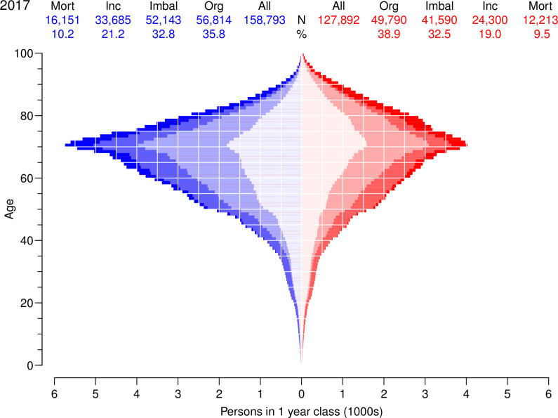
Figure 1.
Age distribution of persons with diabetes in Denmark as of 1 January 2017 according to components of the changes in diabetes prevalence 1996–2016. Figures at the top is the number, respectively percentages attributable to the four factors. The colored areas are number of cases attributable to Mort: declining mortality (full color), Inc: increasing incidence (pale color) and Imbal: incidence/mortality imbalance 1996 (weak color). The weakest color in the middle (Org) corresponds to the number of cases that would have been present if age-specific prevalences were as of 1 January 1996. Men in blue, women in red.

