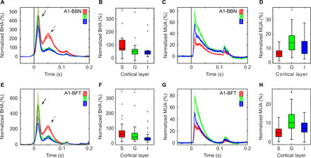
Fig. 3. Differential laminar distribution of BHA and MUA across experiments in A1.

(A to D) presents data from A1 recordings during presentation of broadband noise (A1-BBN; duration, 100 ms; n = 26, two animals). (E to H) shows data from A1 recordings during presentation of best frequency tones [A1-BFT; 100-ms duration; n = 26, same two animals as in (A to D)]. Line plots show the time course of BHA (A and E) and MUA (C and G) response across supragranular, granular, and infragranular (red, green, and blue lines) layers. x axes indicate time relative to stimulus (A, C, E, G). y axes represent signal change from baseline (i.e., normalized BHA/MUA). Box plots present BHA (B and F) and MUA (D and H) distributions averaged across time after stimulus onset. Supragranular, granular, and infragranular (S, G, and I) layers are plotted as separate box plots. Box plots indicate 25th percentile, median, and 75th percentile; whiskers extend to extreme values not considered outliers, while outliers are marked with crosses. Shading in line plots reflects SEM. Note the consistently different laminar distributions of BHA and MUA in both experiments. Despite different stimuli (i.e., broadband noise and best frequency tones), BHA in the supragranular layers is enhanced relative to that in the granular and infragranular layers, while MUA in supragranular is sparse compared to granular and infragranular. Arrows in (A and E) indicate early (solid line) and late (dashed line) BHA components.
