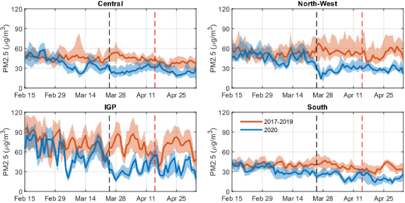
Fig. 1.
Temporal evolution of daily mean PM2.5 concentration before and during the lockdown period for the four study regions. The line plot shows the median and shaded region shows the IQR of mean levels observed at the sites in the respective regions. Vertical black and red lines mark the beginning of 1st and 2nd phases of lockdown respectively. (For interpretation of the references to colour in this figure legend, the reader is referred to the Web version of this article.)

