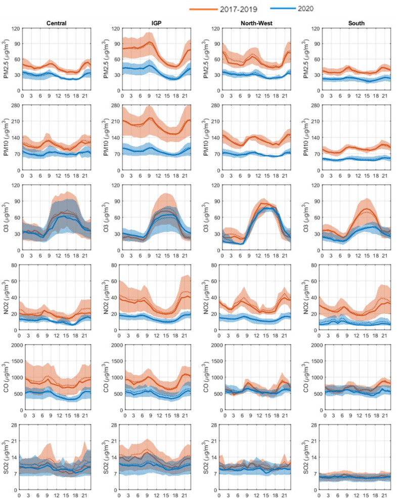
Fig. 4.
Diurnal variation of the six criteria pollutants before and during the lockdown period for the four study regions. The red plot shows the diurnal variation in the pollutants in the previous years and the blue plot is for the current year. Continuous line and the dotted line represent the median and mean respectively and the shaded region shows the IQR of mean diurnal variation observed at the sites in the respective regions. (For interpretation of the references to colour in this figure legend, the reader is referred to the Web version of this article.)

